Our Changing Skyline
Donna Reiner has written many articles over the years for the Arizona Republic and others about Phoenix history and memorials. She is a regular contributor to our newsletter. This month, Donna revisits the many ways that our skyline has changed over the last 100 years.
Nearly 20 years ago I wrote an article that the publication’s editor titled “Building ‘Boom’ Blew Up Beauties.” Rediscovering that article several days ago, I realized that I have been writing variations on this theme ever since.
The early commercial buildings within the original townsite maintained an air of continuity, even if their occupants were in competition with each other. As time passed, the changes in those buildings not only reflected new construction techniques and available money, but also the spirit of their architects. But, has “progress” really improved what we see in Phoenix?
Since Phoenix is young in comparison to most other major U.S. cities, its eclecticness, leaning heavily toward the modern, should not surprise us. In fact, this mixture reflects the natural disparity in our tastes – the ho-hum versus the WOW! being a matter of personal opinion or preference. Yet, whatever happened to constructing edifices that will stand the test of time, buildings that many of us admire year after year because we continually notice some new detail about them and know that the architect was keen on expressing himself in the design? Where are those architectural statements, the classics that will be appreciated and whose designers will be remembered for 100 years or more?
Residents and visitors are confronted with a plethora of modern structures in the downtown area that seem to lack any particular personal architectural signature. When it comes to the architecture of the commercial buildings including those high-rise residential structures, one has to wonder what has happened in the last 40 years or so. Where’s the imagination and creativity in design or functionality in our harsh environment? What we now have are boring rectangles: towers with ribbons of cement or masonry of various colors, but generally “desert” tones and glass. Smoked glass, coats of copper, symmetrical design.
On the one hand there is a sameness, a ticky-tacky box syndrome on a monstrous scale. On the other hand, the Sandra Day O’Connor Federal Building, for example, evokes so many critical comments on its design and impracticality in our desert region that one wonders why it wins such accolades from architectural circles.
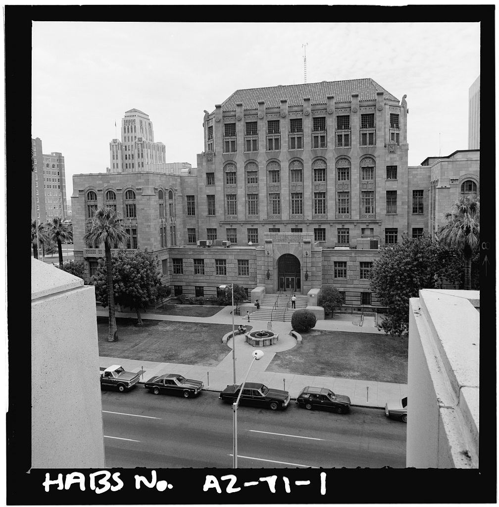
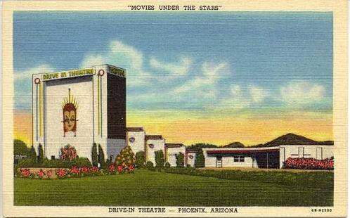
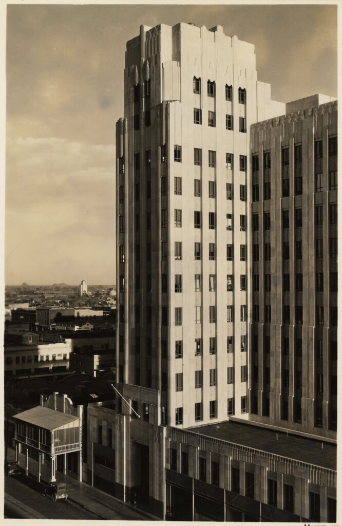
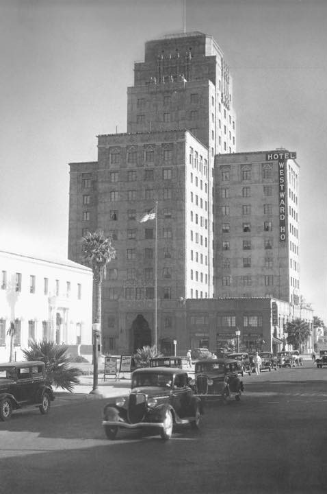
Some of these modern buildings have replaced large two-story homes, schools, theaters, and churches. Instead of lamenting what has disappeared though, make the ongoing effort to keep aware what remains. Be sure to notice the intricate details and other elements of the Professional Building (now the Hilton Garden Inn), the Luhrs block, the City/County Building, the Walker Building, the Westward Ho Hotel, and the Orpheum Theater. If you take your time in studying these and other buildings from different angles and at different times of day, you will see new things. Then compare these grand old structures with their newer counterparts. From a historian’s perspective, retaining “concrete” examples of our past allows our children and future generations to appreciate what it means to lose a historic building in the name of progress.


