Donna Reiner, a local historian and a good friend of Get Your PHX, has written many articles over the years for the Arizona Republic and others about what came before us. We use her services when we list properties of historic significance to help us tell the stories behind the homes.
We are happy that Donna is allowing us to re-publish some of her articles on a monthly basis. If you or your business ever needs a historian, let Donna know at laydeescholar@hotmail.com.
Are you the type who buys new clothes each year to keep up with that year’s changing styles? For buildings, changes to a “new” style may be as simple as applying stucco over bare brick or removing parapets. Change is something we all encounter or recognize. Or do we?
Whether you are a long time resident of Phoenix or not, you may not realize that a number of fairly well-known buildings have a new outer shell. Yes, over time, upgrades were made to “modernize” their exteriors rather than starting from the ground up and you may be surprised by which ones.
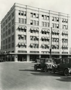
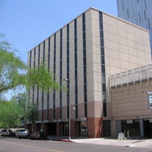
The Ellis Building dates from 1923. Considered modern with its four stories and elevator, two additional floors were added in 1928 to meet the demand for local office space. By the 1950s though, the interior desperately needed upgrades with office and lobby space configurations and new elevator equipment. Still the exterior remained the same. However, the Ellis Building’s owners did something dramatic in 1962 before its fancy tall sleek new neighbor, the Arizona Title Building at 111 W. Monroe, opened in 1964. But check for yourself when you drive by the former City of Phoenix Human Resources Building at 135 N. 2nd Ave.
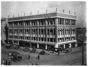
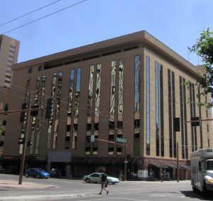
Korricks Store at 106 E. Washington was one of the leading shopping places for Phoenicians to frequent in downtown Phoenix along with Goldwater’s, Hanny’s, and Switzer’s. Like the Ellis Building, its interior had been upgraded to keep up with the times and there had been some changes to the exterior. But the major changes would come later after it had served as the home for Maricopa Technical Community College for a number of years. The new owner gave it a contemporary exterior and a new function: an office building.
In 1960, Fred Guirey, a local architect designed the Coronet Hotel at 1001 N. Central (the northeast corner of Roosevelt and Central). Later it was converted into office space. But in 1984, the building was stripped to its bare steel bones and concrete, received an entire new skin of glass which is the way you see it today. More square footage was added along with a parking garage.
If you are anxiously awaiting the opening of Cornish Pasty Company at 3 W. Monroe, try to imagine how the building once looked with its exposed red brick.
Sometimes we love the new clothes and other times we wonder what were we thinking. The same goes with alterations to buildings. Do you like the new look or prefer the old?


 ing when an HOA can force the sale of your home, and how one state senator wants to make it even easier for HOAs to take your property.


