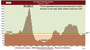
Here are some graphs that tell me so much about where the market is right now, and where we can expect it to be for the next year. Thanks to my friends at the Cromford Report for this illuminating analysis. Click on each chart for a larger view.
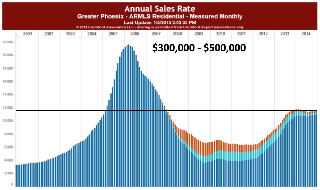 1) Annual Sales Rates — This chart tells the story of where this market has come from and where it is now. Notice that the number of sales per year peaked just before the Great Recession, crashed during the recession and climbed back over 2011 to late 2013. Most interesting, look at where it is now. We hit this point and now we are at a plateau. Is that bad? Nope. See the next chart.
2) Cromford Index Over the Long Term — This tells you where we are: equilibrium. If you look back at older posts, you will see that I talk a lot about the Cromford Index. This tells you not only whether we are in a buyer’s market or a seller’s market, but by how much. If we are over 100, it is a seller’s market. If we are under 100, it is a buyer’s market. Notice that we are hovering just under 100, but just within reach. Notice also that it seems to be staying there, at just about the same time in history that is shown as that plateau in the chart above. So, what this means is that buyers and sellers have roughly the same amount of leverage. This means that we homes are selling, but not there is neither a rush to cash out nor a rush to hold. That’s a healthy market.
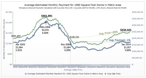 3) Price vs. Payment — So, why is this? Well, despite the lowering real income over time of the American family, the super-low interest rates are helping drive the real estate market. When you look at this chart, you can see that your monthly payment will get you much more house than it would back in 2008. So, affordability is much better right now. This, friends is the actual impact of low interest rates –in action. Yep. Its like an action movie.
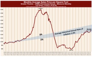 4) Long-term Price Per Square Foot. — So, where are we going? As I’ve been telling clients, we are in a slow, healthy upward climb in home prices. If you look at this chart, you will see the 2% to 3% range of long-term growth in prices, shown in the grey shaded area. Notice that, after the recovery of 2011 to 2013, prices are skirting the lower range of that shaded area. So, no bubbles and no drops.
What does this mean? It means that if you are buying, prices are sliding slowing upward, but your buying power is strong. If you are thinking about selling, you might as well do it now while buyers have more purchasing power. If you wait a year, the most you will gain on your sale (unless you do major renovations) will probably be about 2%. In other words, sell based on need, not on a desire to play the market.
As usual, I can help you make the right decision. Give me a call at 602-456-9388.


